

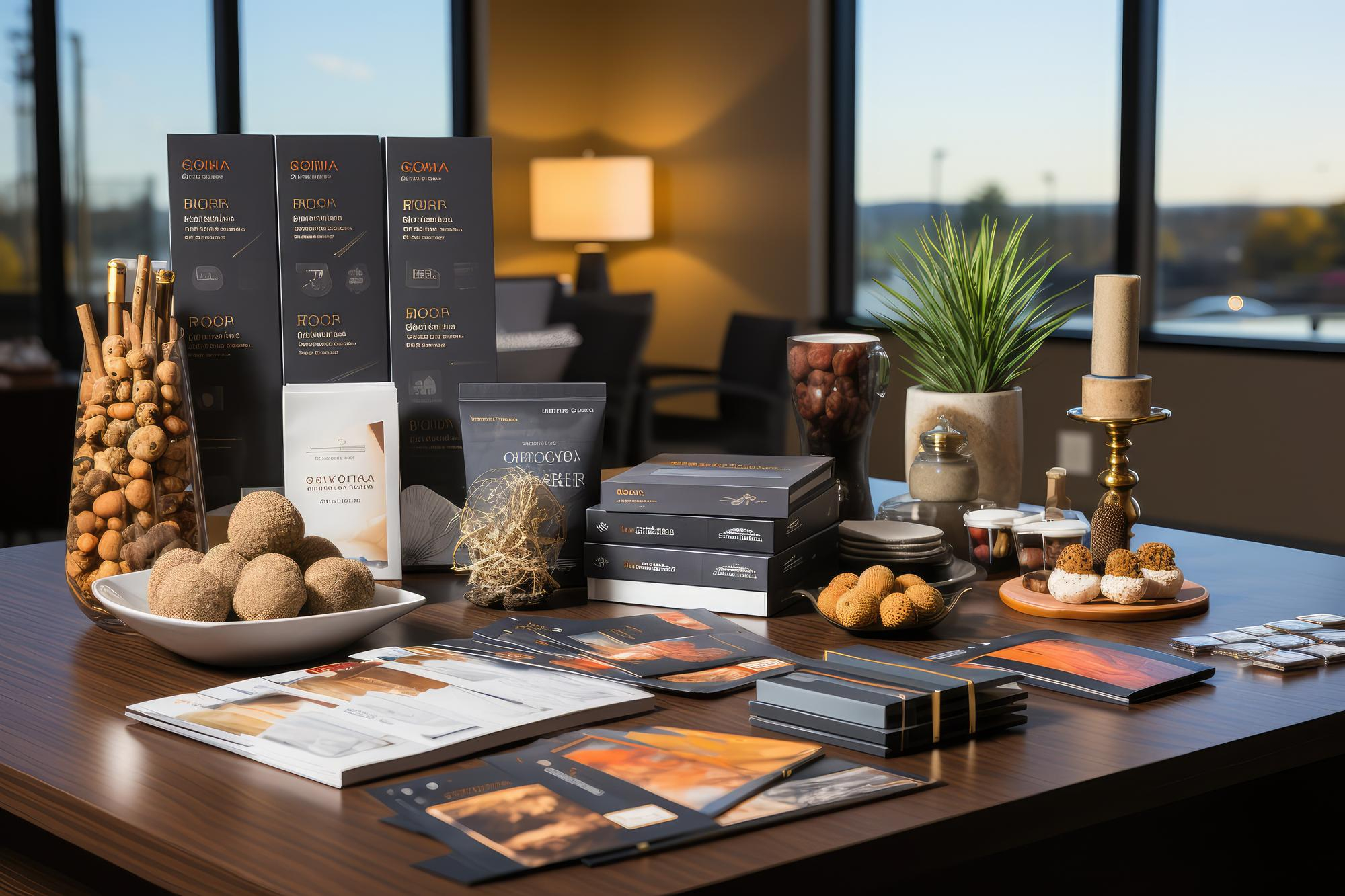
From Menu Design to Interiors: How Visual Identity Shapes a Restaurant’s Brand?
Before a guest tastes a single dish, they’ve already formed an opinion about the restaurant. The logo on the door, the font on the menu, the color of the walls, the weight of the plate in their hand — all of it registers within seconds, long before the kitchen gets a chance to prove itself. That instant, wordless judgment is precisely what visual identity for restaurant branding is built to shape.
In a market as visually driven as the UAE’s, where diners often see a restaurant on a phone screen before ever walking through the door, this identity has stopped being a nice-to-have finishing touch. It has become one of the clearest signals of quality, price point, and personality a restaurant can send before a single word is spoken. This guide walks through how every visual element — from the menu in a guest’s hands to the walls around them — works together to build, or quietly undermine, a restaurant’s brand.
What Visual Identity for Restaurant Branding Actually Means?
Visual identity for restaurant branding covers far more ground than most owners initially assume, and treating it as just a logo project misses most of its value.
More Than Just a Logo
Many restaurant owners commission a logo, pick a color for the signage, and consider the branding work finished. In reality, that’s the smallest visible fraction of what shapes how a guest perceives the brand. Restaurant visual identity spans everything a customer sees, touches, or photographs — the texture of the menu paper, the typeface on a delivery box, the uniform a server wears, the plating style of a signature dish.
The Elements That Make Up a Restaurant’s Visual Identity
A complete visual identity typically includes the logo and wordmark, a defined color palette, chosen typography, menu layout and design, interior architecture and furniture, lighting design, plateware and garnish style, packaging, staff uniforms, a consistent photography style, and the visual language carried across social media. None of these elements works in isolation — each one either reinforces or contradicts what the others are trying to say about the brand. A restaurant with an elegant, minimalist logo but a cluttered, oversized-font menu is sending two different messages to the same guest within the same five minutes, and most diners register that contradiction even without being able to name it.
This pattern shows up clearly in how some of Dubai’s most recognizable F&B entrepreneurs have built lifestyle brands around a single visual identity, long before advertising budgets ever entered the picture.
Why Visual Identity Deserves Investment Early, Not After Growth?
Waiting until a restaurant has proven itself before investing seriously in visual identity usually means rebuilding brand recognition from scratch later, at far greater cost.
It’s a common sequence in the UAE’s fast-moving F&B scene: a concept launches quickly with a placeholder logo and a menu formatted in whatever software was on hand, planning to “fix the branding later” once the business proves itself. The problem is that customers form their impression of the brand during exactly that early period, and changing course after loyal customers already recognize an inconsistent, unpolished identity is far harder than getting it right from the first day of service.
This doesn’t mean every detail needs to be perfect before opening night. It means the core decisions — logo, color palette, typography, and a basic menu structure — deserve real thought upfront, since every other visual decision that follows will be built on top of them. A rebrand a year or two into operation is far more disruptive and expensive than getting the foundation right the first time, particularly once that identity is already printed on packaging, painted on walls, and embedded across dozens of delivery app listings.
Menu Design as a Branding Tool, Not Just a Price List
A menu is rarely just a list of dishes and prices — it’s often the single most-handled piece of branded material a restaurant produces.
Layout, Typography, and the Psychology of Choice
Where the eye naturally lands on a page, how prices are formatted, and how much white space surrounds each item all quietly influence what a guest orders and how much they’re willing to spend. Removing currency symbols next to prices, framing a handful of dishes in a subtle box, and using descriptive rather than purely functional language are all small menu design and visual branding decisions that add up to a noticeably different ordering pattern.
How Menu Design Reflects Positioning?
A fine-dining menu typically leans on generous whitespace, restrained typography, and few visual distractions, letting the food and service carry the weight of the experience. A casual dining menu can afford bolder colors, icons, and value-driven framing, since the brand personality it’s projecting is friendlier and less formal. Cloud kitchens face a different challenge altogether: since the printed menu barely exists, photography and app-store descriptions end up doing almost all of the branding work a physical menu would normally handle.
None of this is accidental — it mirrors the deliberate layout and pricing psychology now standard in Dubai’s most profitable menus.
Getting this balance right is exactly why so many F&B brands now bring in specialized restaurant menu design work rather than formatting a price list in-house.
Logo, Color, and Typography: The Building Blocks of Recognition
Long before a guest reads a single word on the menu, color and shape have already done most of the work of setting expectations.
Choosing Colors That Match Cuisine and Positioning
Warm reds and oranges tend to evoke appetite and energy, which is why they show up so often in fast-casual and grill concepts. Deep greens and earth tones signal an organic or health-focused positioning, while black paired with gold or deep jewel tones tends to read as premium. Pastels and soft neutrals dominate café and dessert branding for a reason — they feel light, approachable, and photogenic in exactly the way a heavier palette wouldn’t. In the UAE specifically, warm gold accents and seasonal shifts in branding around Ramadan and National Day carry cultural resonance that a purely imported color strategy often misses.
Consistency Across Signage, Packaging, and Digital Platforms
That first impression starts even earlier than the menu, with the way a restaurant’s logo sets expectations before a guest even reads the menu. A logo that appears in slightly different colors on the storefront sign, the Instagram profile, and the delivery app listing quietly erodes the very recognition it’s supposed to build. Locking exact hex codes, font files, and logo spacing rules into a simple internal document prevents this drift long before it becomes visible to customers.
Typography as a Brand Signal
Font choice carries almost as much weight as color, even though it rarely gets the same attention. A slab serif or hand-lettered script tends to suggest warmth, tradition, or craft — the kind of typography that fits a heritage Emirati restaurant or an artisanal bakery. A clean, geometric sans-serif reads as modern and efficient, which is why so many fast-casual and cloud kitchen brands gravitate toward it. Mixing more than two typefaces across a single brand’s materials is one of the fastest ways to make an otherwise well-designed identity look accidental rather than deliberate.
How Interior Design Shapes Brand Perception?
A restaurant’s interior does more brand-building in the first ten seconds of a visit than most marketing campaigns manage in a month.
Lighting, Layout, and Mood
Warm, dim lighting signals intimacy and encourages guests to linger, which suits a concept built around leisurely dinners but works against a fast-casual lunch spot that needs to turn tables quickly. Bright, even lighting reads as casual and family-friendly, while table spacing itself sends a message — tightly packed seating suggests energy and buzz, while generous spacing signals a calmer, more deliberate pace of service. This extends well beyond the table setting, into how lighting and layout choices shape the way customers experience a restaurant the moment they walk in.
Designing for Photos Without Sacrificing Function
A striking wall, a neon sign, or a distinctive corner built specifically for photos can genuinely extend a brand’s reach through organic social sharing. The mistake many UAE restaurants make is prioritizing that one photogenic feature so heavily that it disrupts table flow, blocks walkways, or eats into seating capacity the business actually needs to stay profitable.
The best-designed dining rooms aren’t necessarily the most photogenic. They’re the ones where the photogenic details never get in the way of the meal itself.
Designing Multi-Zone Interiors for Different Dining Occasions
Many UAE restaurants now serve a wider range of occasions under one roof than they did a decade ago — a solo diner grabbing a quick lunch, a group celebrating a birthday, a couple on a quiet dinner date. Rather than applying one uniform layout across the entire space, some of the more thoughtfully designed venues create distinct zones: brighter, closer seating near the entrance for quick, casual visits, and dimmer, more spaced-out seating further inside for longer, more intimate occasions. This kind of zoning lets a single restaurant’s interior serve several different brand promises at once without feeling inconsistent, provided the transition between zones still uses the same underlying materials, colors, and design language.
Packaging and the Takeaway Experience as an Extension of Brand
For delivery-heavy F&B brands, packaging is often the only physical brand touchpoint a customer ever experiences.
A guest who never sets foot inside the restaurant still forms an opinion the moment a delivery bag arrives — whether the box kept the food intact, whether the packaging felt considered or generic, whether a small printed note or sticker made the unboxing feel like part of the brand rather than an afterthought. For delivery-heavy brands, that impression doesn’t end at pickup — it continues in how packaging quietly influences buying decisions long after the order is placed.
This is usually where F&B brands invest in dedicated packaging design work rather than defaulting to generic containers with a sticker slapped on top. Sustainable packaging in particular has shifted from a niche preference to a near-expectation among UAE consumers, adding another layer to what “good” packaging design now needs to account for.
Photography and Visual Content as Part of Brand Identity
A dish can be plated perfectly and still fail to convert a single order if the photo representing it online doesn’t do it justice.
Food Photography Standards
A dish plated beautifully but photographed poorly still loses the sale online, which is why professional food photography has become as central to branding as the plating itself. Consistent lighting, a defined angle style, and a coherent color grading approach across every dish photo make a menu feel curated rather than assembled from whatever lighting happened to be available that day.
Keeping Visual Content Consistent Across Social Media
A restaurant’s Instagram grid or TikTok feed functions as a second interior — an extension of the physical space that most potential guests actually see first. Filters, framing, and color tone that match the restaurant’s real-world palette make that transition from screen to storefront feel seamless rather than like two different businesses. A restaurant with warm, golden-lit interiors but a cool, blue-toned Instagram feed sends two conflicting messages about what kind of experience actually awaits, and guests notice that mismatch even when they can’t quite articulate why the gap feels off.
This extends to who appears in that content as well. Restaurants that mix professionally shot dish photography with unedited guest-submitted content, without any visual thread tying the two together, end up with a feed that reads as disorganized rather than authentic. A simple style guide — preferred filters, consistent caption tone, a rule of thumb for how often user-generated content gets reposted versus original photography — keeps that balance from drifting over time.
Keeping Visual Identity Consistent Across Every Touchpoint
Consistency is the quiet, unglamorous discipline that separates recognizable restaurant brands from ones that blur into the background.
Keeping all of this aligned, from the smallest in-store detail to the Instagram grid, is essentially what a properly structured corporate visual identity system is designed to do.
- Menu, print and digital: Fonts, colors, and layout should match exactly whether a guest is reading a physical menu or browsing a delivery app.
- Signage and storefront: Exterior branding should use the same logo file and exact color values used everywhere else, not a slightly different version approved years earlier.
- Packaging and delivery bags: Takeaway materials should feel like an extension of the dine-in experience, not an unrelated afterthought.
- Staff uniforms: Color and styling should echo the same palette guests see on the walls and the menu.
- Website and social profiles: Profile photos, cover images, and color themes should be updated together whenever any part of the identity changes.
- Delivery app listings: Logos and cover photos on Talabat, Deliveroo, and Careem are frequently the most outdated brand asset a restaurant has, simply because they’re rarely revisited.
Common Visual Identity Mistakes UAE Restaurants Make
Most visual identity problems aren’t dramatic failures — they’re small inconsistencies that accumulate until the brand feels unfocused.
Few of these mistakes happen all at once. They tend to creep in gradually, one rushed decision at a time — a new print vendor using a slightly different shade of the brand color, a delivery app listing nobody thought to update after a rebrand — until the cumulative effect starts to look like carelessness rather than a series of small oversights.
- Rebranding without updating every touchpoint: A new logo on the storefront but an old one still live on delivery apps confuses more than it impresses.
- Inconsistent logo colors across platforms: Slightly different shades of the same color, applied inconsistently, undercut the recognition a strong logo is supposed to build.
- Prioritizing aesthetic over function in interiors: A stunning feature wall that blocks foot traffic or reduces usable seating costs more in lost covers than it earns in social shares.
- Treating photography as an afterthought: Inconsistent, low-quality photos undermine even a well-designed menu and interior.
- Copying design trends without matching them to positioning: A minimalist, high-end aesthetic borrowed for a budget-friendly concept sends a confusing signal about pricing.
- No documented brand guidelines: Without a simple reference document, every new hire, designer, or print vendor makes slightly different visual decisions over time.
These slip-ups explain why branding discipline matters so much for new businesses entering a crowded UAE market, where visual inconsistency is rarely forgiven by attention spans this short.
Frequently Asked Questions About Restaurant Visual Identity
A few questions come up often enough from UAE restaurant owners planning a new concept or a refresh to deserve direct answers.
How much should a new restaurant budget for visual identity and design?
This varies widely by concept and scale, but the more useful principle is sequencing rather than a fixed number: logo, color palette, and menu design typically come first, since they touch every other decision, followed by interior and packaging once the brand direction is locked in. Treating design as a single upfront cost rather than an ongoing investment tends to produce identities that age poorly within a year or two.
Can a restaurant refresh its interior without a full rebrand?
Yes, and this is often the more sensible path for an established restaurant with existing brand recognition. A refresh that keeps the same logo, colors, and overall positioning while updating furniture, lighting, or layout can modernize the space without confusing loyal guests who already associate the brand with something specific.
Does visual identity matter as much for cloud kitchens without a physical dining room?
It matters just as much, though the emphasis shifts. Without an interior to make a first impression, packaging, food photography, and app-store presentation carry almost the entire weight of the brand’s visual identity, which makes consistency in those specific areas even more important than it would be for a restaurant with a dining room to fall back on.
How often should a restaurant update its visual identity?
There’s no fixed schedule, but a periodic review — roughly every three to five years, or whenever the menu, positioning, or target audience shifts meaningfully — helps catch an identity that’s quietly started to feel dated before customers notice it first.
Who should be involved in visual identity decisions besides the owner?
Front-of-house staff and kitchen leadership are worth including early, since they interact with the physical space, uniforms, and plateware daily and often notice practical friction a designer working from renderings alone might miss. A designer or agency familiar with F&B specifically, rather than general branding, also tends to catch details — like how a menu holds up after being wiped down fifty times a night — that matter more in a restaurant than in most other business categories.
Turning Visual Identity Into a Long-Term Brand Asset
A restaurant’s visual identity is rarely built in one sitting, and it’s never really finished. It grows through every menu reprint, every new hire’s uniform, every packaging redesign, and every photo posted to social media. Treated with intention, that accumulation becomes one of the most durable assets a restaurant owns — one that keeps working quietly in the background long after any single marketing campaign has ended.
A restaurant’s food gets it a first visit. Its visual identity, applied consistently, is what makes that first visit feel familiar the second, third, and tenth time around.
For F&B brands willing to treat design as strategy rather than decoration, the payoff isn’t a prettier restaurant — it’s a brand customers recognize instantly, trust intuitively, and choose without needing to be convinced all over again. Every reprinted menu, every new hire’s uniform, and every packaging update is a small chance to either reinforce that recognition or quietly chip away at it, which is exactly why treating visual identity as a one-time project rather than an ongoing discipline tends to be the most expensive mistake a growing restaurant brand can make.
